Don’t Do This to Your Clients
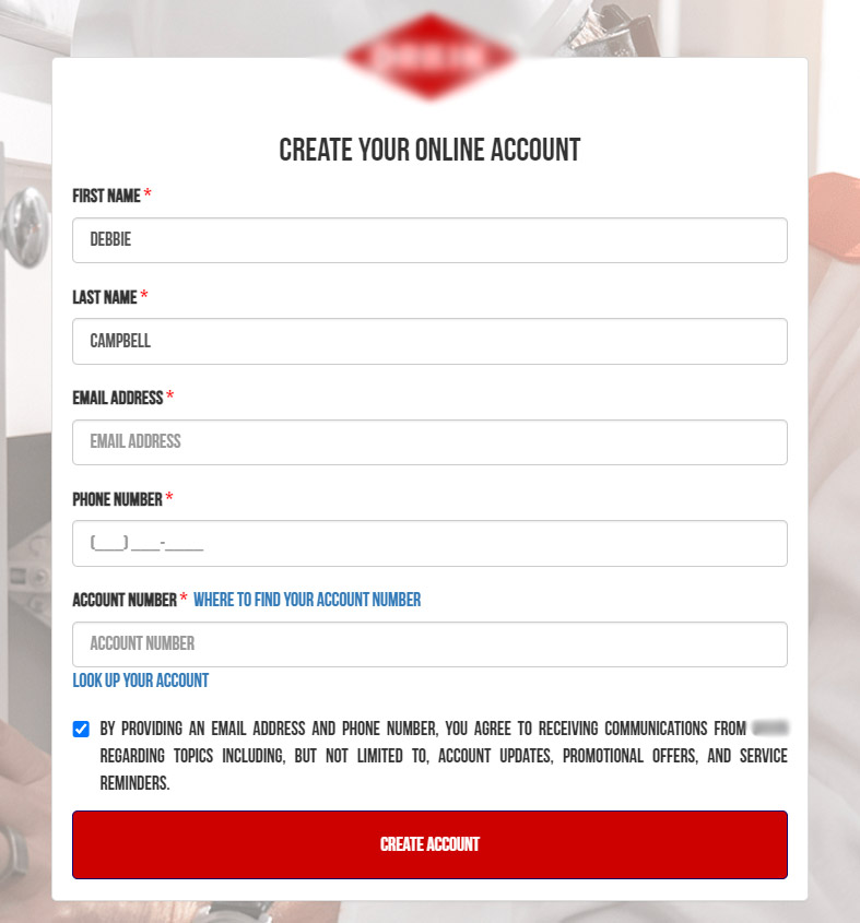
This is a great example of what not to do with your forms. Check this out:

What’s wrong with this form? Let’s go over it.
The font size is too small.
The font size for everything after ‘Create Your Online Account’ is 14px. It’s widely recommended that 16px be the body font size for a website, but this is a different case – this particular font is not very legible at small sizes. This font would need to be closer to 18px to really be easily readible. But…
The form uses all caps.
All caps can have its place, but a form is not one of them. All caps makes text more difficult to scan and read and some users may experience it as shouting. Typically you’d only use it for buttons, tags and other small elements that don’t require attentive reading.
Errors are hard to read.
Error messages are (surprise) even smaller at 13px. This is unreadable for many people even if it weren’t in all caps – but it is. Make errors noticeable and clear so the user can correct them.
Prechecked privacy consent.
User consent should be an active choice and not pre-decided for you. This is a requirement of GDPR (the European privacy rules). I know we’re not in Europe, but it’s just good policy to respect your users.
In short, make your form easy to use.
Why put roadblocks in front of potential customers? Don’t you want new customers? If so, show them by making it as easy as possible to use your website.
